


With many offices closing their doors this year, many people have found themselves working from home (WFH). Whether you’re working from the kitchen table, or you are one of the fortunate ones with a home office, your environment plays an important role on your mood and productivity.
- Psychologists reveals the paint colors which increase or decrease productivity.
- Neutral paint colors like white, grey, and beige tend to induce sad and depressive feelings, especially for females.
- Blue is the official color of productivity. It promotes calm concentration and emotional balance that helps to keep you in a state of flow.
- Yellow is seen as the color of creativity and is often used in innovation labs and creative spaces.
- Males should avoid colors like orange or purple as it’s said to decrease productivity.
MyJobQuote.co.uk spoke exclusively to Lee Chambers MSc MBPsS, Psychologist and Wellbeing Consultant, to learn more about the colors we should be painting our walls, and the colors we should avoid if we want to feel more productive whilst working.
Top 10 WFH colors, as revealed by the public
- White (54%)
- Beige (37%)
- Grey (32%)
The survey* revealed that most people (54%) work from rooms painted classic WHITE. In second place is BEIGE (37%), followed by shades of GREY (32%). But does choosing, classic, neutral colors promote productivity? Lee Chambers says:
“Interestingly, a University of Texas study concluded that offices without a splash of color, especially those in neutral white, grey and beige tended to induce some sad and depressive feelings, especially for females.”
- Yellow (24%)
The fourth most popular color is YELLOW, with 24% of respondents saying this is the shade of their WFH space… To that Lee Chambers has said:
“Yellow is seen as the color of creativity and is often used in innovation labs and creative spaces. An interesting feature of yellow backgrounds is that they increase information retention, which is helpful for highlighting key learnings and important information. If you have a creative job, yellow is definitely a solid choice, but be mindful of the overuse of yellow as a background and as a space, as it does induce eye fatigue. We can become agitated and lose emotional balance if exposed to yellow for long periods.”
- Blue (22%)
When it comes to the 5th most popular paint color, the survey can reveal BLUE to be popular, with 22% of people saying they work from rooms painted in blue tones. But is that a color that makes you feel productive, or does it make you feel well… blue?
“Blue is known as the official color of productivity. It promotes calm concentration and emotional balance that helps to keep you in a state of flow. However, too much blue can leave you a little too relaxed and blunt your innovative streak, so consider adding some warm color accents.”
Shades of blue are also very important from a psychological viewpoint: “Turquoise has been identified as finding a balance between blue and green, taking benefits of each and having been shown in office environments to improve decision making and creative communication.”
- Orange (17%)
In 6th place is ORANGE, making up 17% of rooms:
“The same study by the University of Texas has revealed that the color orange is especially detrimental to men when it comes to boosting productivity. However, if you opt for a peachier shade, that can be perceived as happy and welcoming.”
- Green (15%)
The lively and fresh color GREEN comes in 7th place (15%), but would it make us feel more energised, or quite the opposite?
“Green is the color of nature, and we can see more shades of green than any other color. Being the color of serenity and growth, it causes less eye fatigue, which helps longer-term focus and attention. It is calming in a similar way to blue, but research shows that it produces less benefit for productivity, but a higher increase in wellbeing, and is a great color for a balance of the two.”
- Red (12%)
In 8th place is fiery RED (12%), but does it make you feel passionate about work?
“Red is a powerful, vibrant color, and is very situational in its use for productivity gains. Studies have found the emotive and passionate fire of red raises blood flow and heart rate. This is great for physical tasks, like a little natural energy bar. Red naturally draws the eye and is often the color of emergency objects for a reason. For a home office, red can very easily become overstimulating, causing us to lose focus and concentration, and gradually feel volatile, increasing the potential for mistakes or conflict. Use red wisely to take advantage of its benefits.”
- Pink (6%)
- Purple (4%)
PINK ranks as the penultimate color of popularity, with 6% of people opting for this color in their work from home space, which Lee Chambers considers to be “indulgent and warming”.
PURPLE (4%) is least common, with Chambers adding: “Just as it is with orange, males struggled with productivity in purple spaces as they lower mood. When it comes to purple, this can be perceived as noble and luxurious.”
Other tips to increase your WFH productivity through your environment:
“Some things to consider are that the color of your desktop is continually in your eye line and is a perfect place to utilise productive colors. Get some plants in your eye line, and you get both the green vista, and the air-purifying benefits too. Have a canvas that incorporates colors behind your workstation, and definitely try and get as much natural light, especially through winter.”
* MyJobQuote.co.uk surveyed 4,626 people who are WFH to find out what paint colors feature most in the room people choose to work in.
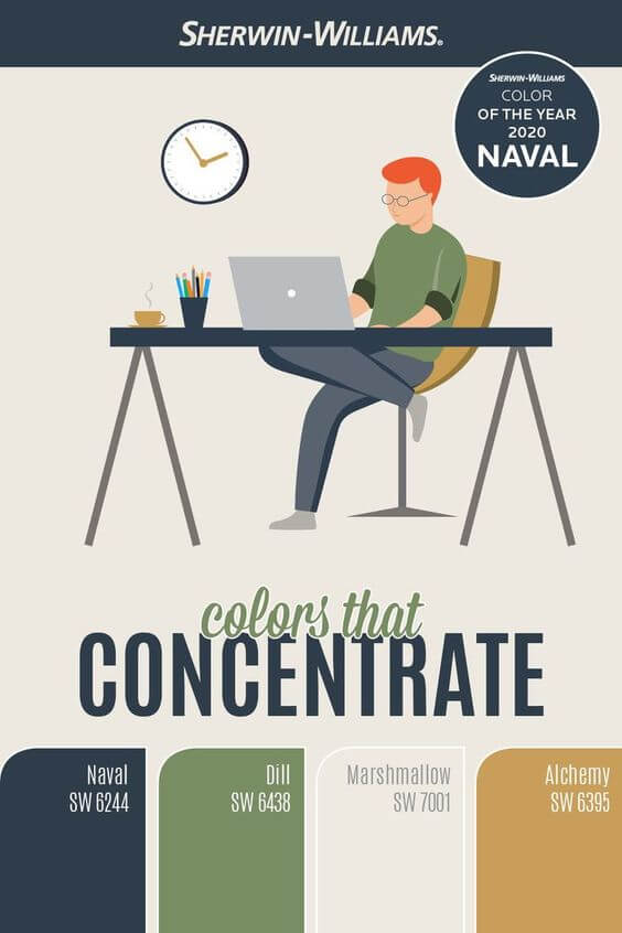
Check out Sherwin Williams “Colors that Concentrate” for more WFH inspiration.